GRAPHIC CONTENT, 2021

In 2015, Raban Ruddigkeit started a weekly graphic commentary for the Berlin newspaper DER TAGESSPIEGEL. To date around 250 works have been published, 50 of which have been selected for this black and white compilation. In addition, some free graphics designs that were created for social media and personal products.

Fifty shades of black and white
Ein Vorwort von Holm Friebe
Immer, wenn ich Raban Ruddigkeit auf der Straße begegne, muss ich an Leonard Cohen denken: ein nicht besonders großer, nicht mehr ganz junger, schmaler Mann mit Hut, ganz in Schwarz gekleidet, verbindlich, humorvoll, aber distanziert und auf eine demütige Art souverän und selbstbewusst. Die Assoziation geht über das Physiognomische und Habituelle hinaus. Rabans Arbeit erinnert nicht von ungefähr an die Texte und die Musik von Leonard Cohen – nicht der schwülstige Cohen von »Halleluja« oder der von Phil Spector überproduzierte Cohen von »Death of a Ladies’ Man«, sondern der spätere, ruhigere und abgeklärte Cohen. Die Anfangszeile von Cohens 2019 posthum veröffentlichten Songs »Happens to the Heart«, »I was always workin’ steady, but I never called it art« könnte als Motto über dem Schreibtisch des Grafikdesigners hängen. Ruddigkeits Designs sind wie Cohens Songs ein Abwehrzauber gegen den magischen Realismus des Marktplatzes, gegen das Grelle, das Bunte und das Exaltierte: unzeitgemäß zeitlos und im besten Sinne gegen den Zeitgeist gebürstet. Einen Zeitgeist, der seit etwa Mitte des 20. Jahrhunderts dadurch geprägt ist, dass die hehren Ideen von Aufklärung, Werkbund und Bauhaus korrumpiert und überformt wurden durch die Profis aus Marketing und Werbung. Wie Max Horkheimer und Theodor W. Adorno in ihrer Analyse der Kulturindustrie hellsichtig schreiben: »Show heißt allen zeigen, was man hat und kann. Sie ist auch heute noch Jahrmarkt, nur unheilbar erkrankt an Kultur.«
Ohne geschmäcklerisch zu werten und in die Falle des elitären Snobismus zu tappen, lässt sich doch nüchtern feststellen, dass es die Entscheidungsstrukturen und Abstimmungsprozesse des immateriellen, kognitiven Marktkapitalismus die bestimmte gefällige, gleichzeitig Aufmerksamkeit heischende und marktschreierische Designentscheidungen begünstigen. Das alles unter der Maßgabe, dass die symbolische Aufladung von Produkten und Dienstleistungen zum wichtigsten Wertschöpfungstreiber geworden ist, nicht Produktdesign oder Qualität – »Brands, not products«, bringt es Naomi Klein in ihrer Kampfschrift »No Logo« auf die Formel. Man könnte auch sagen: Kultur, unheilbar erkrankt an Design. Und: Design, unheilbar erkrankt an Bullshit.
»Eines der hervorstechendsten Merkmale unserer Kultur«, schreibt der Princeton-Philosoph Harry G. Frankfurter in seinem mittlerweile berühmt gewordenen Essay »On Bullshit« aus dem Jahr 1986, »ist, dass es so viel Bullshit gibt”. In der präzisen Terminologie Frankfurters meint »Bullshit« bestimmte prätentiöse Sprechweisen, die dadurch gekennzeichnet sind, dass dem Sprechenden der Wahrheitsgehalt seiner Äußerungen vollkommen gleichgültig ist. Dieses elastische Verhältnis zur Wahrheit ist kein grassierender angeborener Defekt. Es ist der Tatsache geschuldet, dass sich immer mehr Menschen in unübersichtlichen Situation hierarchischer oder politisch aufgeladener Gruppendynamiken verhalten müssen. »Groupthink« nennt man diese ideologisch aufgeladenen Parallelwelten, in denen eigene Regeln, Logiken und Naturgesetze gelten. Die beste Option in einer derart korrumpierten Fitness landscape ist es, nicht anzuecken und opportunistisch das am wenigsten Anstößige und Geländegängigste zu formulieren: das wohlfeil-schwammige Neusprech im jeweils angesagten Jargon der Zeit, die modischen Buzzwords, mit denen alle Mandats- und Entscheidungsträger, Movers & Shakers sich gegenseitig so gern einmassieren, ohne jemals deren Sinngehalt abzuprüfen, »this years model« der Hochwertworte und Wohlfühlvokabeln, nach denen schon morgen kein Hahn mehr kräht, weil sie innerhalb einer Saison bereits abgestanden, schal und ranzig im Munde liegen. Bullshit eben.
Analog und ganz im Geiste Frankfurters konstatiert der kalifornische Unternehmensberater Richard P. Rummelt in seinem verdienstvollen Buch »Good Strategy, Bad Strategy« die Zunahme »schlechter Strategie« und seziert deren Funktionsweise. Bad strategy ist nicht einfach nur die Abwesenheit guter Strategie – gekennzeichnet durch ehrliche Problembeschreibung, Fokussierung und Verzicht – , sondern sie folgt einer eigenen Logik und hat eine inflationäre Dynamik, ein »Eigenleben« – creepy wie Unkraut: »ein windschiefes Gebäude, errichtet auf dem Fundament falscher Annahmen”. »Immer mehr Entscheider in Organisationen behaupten, sie hätten eine Strategie, aber sie haben keine. (...) Bad Strategy entsteht, weil die Verantwortlichen in Organisationen es vermeiden, die wahren Probleme zu analysieren und zu benennen, um keine negative Stimmung aufkommen zu lassen. (…) Oder sie vermeiden harte Schnitte, weil sie niemandem auf die Füße treten wollen – und erzeugen so eine Bad strategy, die versucht, es allen Recht zu machen, anstatt Ressourcen zu bündeln und Maßnahmen zu fokussieren.« Das erinnere an einen Quarterback beim American Football, der seinem Team als einzige Ansage mitgibt: »Lasst uns gewinnen!« So maskiert Bad strategy Entscheidungs- und Führungsschwäche, »indem sie sich einer Rhetorik der hehren Ziele, Ambitionen, VIsionen und Werte bedient”. Rummelt hat einen schönen Begriff für diese Nebelkerzen-Rhetorik: Fluff, auf deutsch: Flaum. Er breitet sich aus, quellend, weich und wattig, umwölkt die Gehirne, verstopft die Poren der Organisation für kritisches analytisches Denken.
Von dort aus ist es dann nur noch ein kleiner Schritt zur Umsetzung in zeitgenössisches Grafikdesign, seinen Moden, Eskapaden und Blendgranaten. Einiges spricht dafür, dass es überhaupt nur zwei Techniken gibt, Neues zu schaffen und in die Welt zu bringen. Man könnte an dieser Stelle bereits den Fetisch des »Neuen« als Bullshit problematisieren: Warum braucht es immer neue Ideen? Die alten sind doch noch gar nicht verbraucht. Ein Sushi-Großmeister ist auch nicht kreativ, nicht einmal originell. Er kann ein ganzes Leben lang daran arbeiten, das richtige Verhältnis und Arrangement von Reis, Fisch, Wakame und Wasabi zu perfektionieren. Am Ende geht es um ein Reiskorn mehr oder weniger. Es ist ein Privileg der Jugend, neue Ideen zu fordern, wie es ein Privileg der Jugend ist, neue Beziehungsformen, neues Wohnen und neues Arbeiten auszutesten, am besten gleich neue Menschen machen zu wollen. Ebenso ist es das Privileg des Alters, Bullshit upon them zu callen wie Don Draper es in »Mad Men« tut (»Young people don't know anything – especially that they're young.«). Salomonisch könnte man beiden Seiten unrecht geben mit dem zweischneidigen Aphorismus: Das Problem der Alten ist, dass sie denken, es gebe keine neuen Ideen. Das Problem der Jungen ist, dass sie denken, ihre Ideen seien neu. Dabei hat der in allen existenziellen Fragen unbedingt maßgebliche Mark Twain auch zu diesem Problem bereits die letztgültige Antwort längst formuliert: »There is no such thing as a new idea. It is impossible. We simply take a lot of old ideas and put them into a sort of mental kaleidoscope. We give them a turn and they make new and curious combinations. We keep on turning and making new combinations indefinitely; but they are the same old pieces of colored glass that have been in use through all the ages.«
So wie es im Kaleidoskop und anderswo nur die additive und subtraktive Mischung von Farben durch Licht respektive Pigmente gibt, so gibt es prinzipiell nur zwei Arten von kreativer Innovation: die additive und die subtraktive. Die Addition ist intuitiv und geheimnislos; sie folgt der Logik des Wimmelbildes und der Assemblage, wie sie schon im Kindergarten praktiziert wird: »First you do something and then you add something else and you keep doing that and pretty soon you have something.« Die Welt ist voll von additiven Ideen – und täglich kommen neue hinzu. Sie funktioniert auf Anhieb, und stößt selten auf Widerstand der Entscheider. Viel hilft viel. Und ein Verkaufsargument mehr ist besser als eins weniger. Sie steckt somit aber auch hinter der grassierenden »Featuritis« bei Geräten und Gadgets, dem medialen Rauschen, dass uns umgibt und der Reizüberflutung des urbanen Lebens, die eher zu als abnimmt seit der Zeit, als Walter Benjamin die »Heuschreckenschwärme von Schrift« beklagte. Die heute schon die Sonne des vermeinten Geistes den Großstädtern verfinstern.« »Ist ja alles so schön bunt hier, Ich kann mich gar nicht entscheiden”, sang Nina Hagen, die wie Raban Ruddigkeit mit den gedeckten Farben und dem Grau-in-Grau der DDR aufgewachsen ist: »Du hast den Farbfilm vergessen, mein Michael!«
Die zweite Art der Kreativität, die Subtraktive, ist sehr viel subtiler, unzeitgemäßer und fast in Vergessenheit geraten, seit Steinmetze, Holzschnitzer und Lithografen im Paragone der visuellen Künste ins Hintertreffen geraten und von der Flut der digitalen Bilder an den Rand gespült wurden. In Reinform verkörperte sie Michelangelo Buonarotti, neben Leonardo da Vinci der vollständigste Renaissancekünstler, der von seinem David einfach alles wegschlug, was nicht David war: »In jedem Marmorblock sehe ich eine Statue so klar, als ob sie vor mir stünde, geformt und perfekt in ihrer Haltung und Handlung. Ich muss nur die groben Mauern wegschlagen, die die schöne Erscheinung einsperren, um sie den anderen zu zeigen, wie meine Augen sie sehen.« Im Wegschlagen und Weglassen zeigen sich wahre Meisterschaft und Weisheit. Fotografen lieben gemeinhin die »Blaue Stunde«, weil zu dieser Tageszeit die Farben theatralischer wirken und besser zur Geltung kommen. Aber, so wissen wir seit Hegels Grundlinien zur Philosophie des Rechts von 1821, »mit Grau in Grau lässt sie sich nicht verjüngen, sondern nur erkennen. Die Eule der Minerva beginnt erst mit der einbrechenden Dämmerung ihren Flug.« Die Weisheit scheut das Grelle und das Bunte. Sie schlägt ihre Funken aus den fifty shades of black and white. Erst wenn die Farben mit dem abnehmenden Licht verschwinden, erkennt man die Formen und die Strukturen hinter den Dingen. Oder mit Brian Eno und David Byrne »The dimming of the light makes the picture clearer«.
Raban Ruddigkeits Weg ist letzterer, der der abgeklärten Weisheit, der der Subtraktion. Das zeigt sich allein daran, dass er keine Farben mag. In einer SMS zu einer Logoentwicklung schreibt er mir: »Farben sind mir zu emotional, aber da macht ihr einfach, was ihr wollt.« Dieser Satz aus der Mobiltelefontastatur eines Designers. The sound of one hand clapping. Da muss man erstmal hinkommen. Wie ein Samurai hat Raban diesen Weg erforscht, ein halbes Arbeitsleben lang keine l’art pour l’art gemacht, sondern beständig an der Reduktion gearbeitet. No frills. No bullshit. Darin hat er es zu einer Meisterschaft gebracht. Weil es so unzeitgemäß ist – und weil es so einfach aussieht – muss man es vielleicht noch einmal in aller Deutlichkeit sagen: Raban Ruddigkeit ist ein, wenn nicht der Großmeister der Reduktion und trägt den schwarzen Dan des Weglassens. Seine Designs schneiden durch den Zeitgeist, das Rauschen und den Überfluss wie ein Samurai-Schwert aus hundertfach gefaltetem Damaststahl. Am Ende landet er beim schwarzen Punkt und was man damit machen kann. Punktlandung. Niemand kann ihm darin das Wasser reichen. Und was würden wir trinken, wenn wir 1000 Jahre lang nur ein Getränk trinken dürften? Eben!
Holm Friebe ist Bestsellerautor, Designtheoretiker und Markenstratege. Er mag Farben.


Fifty shades of black and white
A foreword by Holm Friebe
Whenever I run into Raban Ruddigkeit on the street, I can't help but think of Leonard Cohen: a not particularly tall, no longer quite young, slender man wearing a felt brimmed hat, dressed in black, authoritative and humorous, but aloof with the reservedness of a humble and self-confident man. The association goes beyond the physiognomic and habitual characteristics. Raban's work is not by accident reminiscent of the lyrics and music of Leonard Cohen – not the campy Cohen of "Hallelujah" or the Phil Spector overproduced Cohen of "Death of a Ladies' Man," but the later, mellow and detached Cohen. The opening line of Cohen's 2019 posthumously released song "Happens to the Heart," "I was always workin' steady, but I never called it art" could be hung over the graphic designer's desk as his moto. Like Cohen's songs, Ruddigkeits' designs are a warding spell against the magical realism of the marketplace, versus the garish, the colorful and the exalted: untimely, timeless and brushed against the zeitgeist in the best sense of the word. A zeitgeist, that has been characterized since the middle of the 20th century by the fact that the noble ideas of the Enlightenment, Werkbund and Bauhaus have been corrupted and reshaped by the professionals from marketing and advertising. As Max Horkheimer and Theodor W. Adorno wrote clairvoyantly in their analysis of the creative industry: "Show means showing everyone what you have and can do. It is still a fair today, only terminally ill with culture.“
Without passing any tasteless judgment and falling into the trap of elitist snobbery, it can be soberly stated that it is the decision-making structures and coordination processes of immaterial, cognitive market capitalism that favor certain pleasing, simultaneously attention-seeking and blatant design decisions. All this under the assumption that the symbolic charging of products and services has become the most important value driver, not product design or quality - "Brands, not products," Naomi Klein puts it in a nutshell in her campaign pamphlet "No Logo." One could also say: culture, terminally ill with design. And: design, terminally ill with bullshit.
"One of the most salient features of our culture," writes Princeton philosopher Harry G. Frankfurter in his now famous 1986 essay "On Bullshit," "is that there is so much bullshit." In Frankfurter's precise terminology, "bullshit" refers to certain pretentious ways of speaking that are characterized by the speaker's complete indifference to the level of truth in his or her utterances. This flexible relationship to the truth is no rampant congenital defect. It is due to the fact that more and more people have to act accordingly in confusing situations of hierarchical or politically charged group dynamics. "Groupthink" is the name given to these ideologically charged parallel worlds in which their own rules, logics and laws of nature apply. The best option in such a corrupted fitness landscape is to avoid clashing and opportunistically phrase the least offensive and most all-terrain thing: the cheap wooly new jargon of the time, the fashionable buzzwords with which all mandate and decision makers, movers and shakers like to massage each other without ever checking their usefulness, "this years model" of high-value words and feel-good vocabulary that no cock will be crowing about tomorrow because they are already stale, stale and rancid in the mouth within a season. All bullshit.
In accordance with and entirely in the spirit of Frankfurter, the Californian management consultant Richard P. Rummelt states in his commendable book "Good Strategy, Bad Strategy" the increase in "bad strategy" and dissects how it works. Bad strategy is not simply the absence of good strategy – characterized by honest problem description, focus and abandonment - but it follows its own logic and has an inflationary dynamic, a "life of its own" - creepy as weeds: "a crooked building erected on the foundation of false assumptions." "More and more decision-makers in organizations claim they have a strategy, but they don't. (...) Bad strategy arises because those responsible in organizations avoid analyzing and naming the real problems so as not to create a negative atmosphere. (...) Or they avoid hard cuts because they don't want to step on anyone's toes - creating a bad strategy that tries to please everyone instead of pooling resources and focusing action." It's reminiscent of a quarterback in American football, he said, whose only message to his team is, "Let's win!" Thus, Bad strategy masks weakness in decision-making and leadership "by using the rhetoric of lofty goals, ambitions, visions and values." Rummelt has a nice term for this smokescreen rhetoric: fluff. It spreads, swelling, soft and fuzzy, clouds the brains, clogs the pores of the organization for critical analytical thinking.
From there, it's just a short step to translating it into contemporary graphic design, its facets, escapades, and stun grenades. Many things speak for the creation of something new, besides the fact that there are only two techniques at all for bringing it into the world. At this point, one could already problematize the fetish of the "new" as bullshit: Why do we always need new ideas? The old ones haven't been used up yet. A sushi grandmaster is neither creative, nor even original. He can spend a lifetime perfecting the right ratio and arrangement of rice, fish, wakame and wasabi. In the end, it's, more or less, one grain of rice. It is a privilege of youth to demand new ideas, just as it is the same privilege to want to try out new forms of relationships, new ways of living, and new ways of working, preferably creating new people altogether. Likewise, it is the privilege of age to call bullshit upon them as Don Draper does in "Mad Men" ("Young people don't know anything – especially that they're young.") Solomon-like, one could prove both sides wrong with the double-edged aphorism: The problem of the old is that they think there are no new ideas. The problem of the young is that they think their ideas are new. Mark Twain, who is absolutely authoritative in all existential questions, has long since formed the ultimate answer to this problem: "There is no such thing as a new idea. It is impossible. We simply take a lot of old ideas and put them into a sort of mental kaleidoscope. We give them a turn and they make new and curious combinations. We keep on turning and making new combinations indefinitely; but they are the same old pieces of colored glass that have been in use through all the ages."
Just as in the kaleidoscope and elsewhere there is only additive and subtractive mixing of colors by light and pigments, respectively, there are in principle only two kinds of creative innovation: additive and subtractive. Addition is intuitive and in the open; it follows the logic of the hidden object and assemblage as practiced in kindergarten: "First you do something and then you add something else and you keep doing that and pretty soon you have something." The world is full of additive ideas – and new ones are added every day. It works right off the bat, and rarely meets resistance from decision-makers. A lot helps a lot. And one more selling point is better than too few. But it is also behind the rampant "featuritis" of devices and gadgets, the media noise that surrounds us, and the sensory overload of urban life, which is increasing rather than decreasing since Walter Benjamin lamented the "swarms of locusts of fonts". Which today are already eclipsing the sun of the supposed spirit for the city dwellers. "Everything is so beautifully colorful here, I cannot decide", sang Nina Hagen, who, like Raban Ruddigkeit, grew up with the muted colors and gray-on-grays of the GDR: "You forgot the colored film, my boy, Michael!“
The second kind of creativity, the subtractive, has become much more subtle, outmoded, and almost forgotten since stonemasons, woodcarvers, and lithographers fell behind in the paragons of the visual arts and were washed to the brink of the frame by the flood of digital images. In its purest form, it was embodied by Michelangelo Buonarotti, next to Leonardo da Vinci the most complete Renaissance artist, who simply chipped away from his David everything that was not David: "In every block of marble I see a statue as clearly as if it were standing before me, shaped and perfect in its posture and action. I only have to knock away the rough walls that imprison the beautiful apparition to show it to others as my eyes perceive it." In knocking away and leaving away, true mastery and wisdom are revealed. Photographers commonly love the "blue hour" because at this time of day the colors look more theatrical and reveal their true value much better. But, as we have known since Hegel's 1821 baseline to philosophy of the law, "with gray in gray it cannot be rejuvenated, but only recognized. The owl of Minerva begins its flight only with the breaking of dawn." Wisdom shuns the garish and the colorful. She strikes her sparks from the fifty shades of black and white. Only when the colors disappear with the waning light do we recognize the shapes and the structures behind things. Or with Brian Eno and David Byrne "The dimming of the light makes the picture clearer“.
Raban Ruddigkeits' path is the latter, that of serene wisdom, that of subtraction. This is shown by the fact that he does not like colors. In a text message about a logo development, he writes to me: "Colors are too emotional for me, but there you go, just do what you want." This sentence coming from a designer's cell phone keypad. The sound of one hand clapping. You have to get there first. Like a samurai, Raban has explored this path, not making l'art pour l'art for half a life's work, but constantly working on reduction. No frills. No bullshit. In this he has achieved mastery. Because it is so untimely – and because it looks so simple – it must perhaps be said again in all clarity: Raban Ruddigkeit is one, if not the grand master, of reduction and wears the black dan of omission. His designs cut through the zeitgeist, the noise and the excess like a samurai sword made of damask steel folded a hundred times over. In the end, he lands on the black dot and what things one can do with just that. Precision landing – on the dot. No one can hold a candle to him therein. And what would we drink if we were allowed to drink only one drink for a thousand years? Exactly.
Holm Friebe is a bestselling author, design theorist and brand strategist. He likes colors.

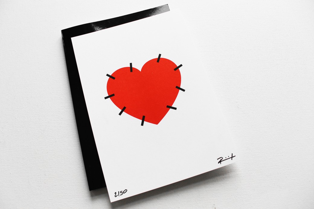
Special edition of GRAPHIC CONTENT with a two-tone risography (numbered & signed) limited to 50 pieces.